Rethinking the
Cross-Chain Swap Experience
Redesigned a legacy swap feature to enable seamless cross-chain transactions within a multi-asset crypto wallet. With AI-assisted research and analysis, the team simplified complexity, improved reliability, and built user trust—particularly for non-expert crypto users during high-stress transactions.
My Role: Design Lead / UX Designer
Duration: 6 months Team: 5 designers
Other Teams: Product, DEVs, Business, Data, CRM

01. Impact
Improved clarity and trust in the swap process
Reduced user friction across key flows
Established a repeatable design–product collaboration framework later applied to other features.
02. Overview
Challenge
The existing swap feature only supported same-chain transactions and had an outdated design. The goal was to introduce cross-chain swaps through a third-party SDK while ensuring a frictionless, intuitive experience that concealed technical complexity from the user.
Objectives
Enable cross-chain swaps without leaving the app
Deliver a seamless flow between native and third-party experiences
Simplify choices and language for non-expert crypto users
Improve clarity, feedback, and reassurance during transaction tracking
Ensure scalability for future updates
03. Research & Competitive Analyses
Benchmark
We tested and analysed leading wallets and DeFi apps to evaluate:
Information architecture and flow structure
Empty states and
edge-case handling
Review and tracking screens
Notification patterns and success feedback
To accelerate this process, we used AI to cluster UX patterns and summarize insights across competitors.
This helped us spot what worked, what didn’t, and how we could simplify things for our users.
Findings guided the UX direction: we didn’t want to overwhelmed users with technical options (provider selection, gas management, advanced settings).
Our approach prioritised clarity over control, with contextual help and minimal decisions.
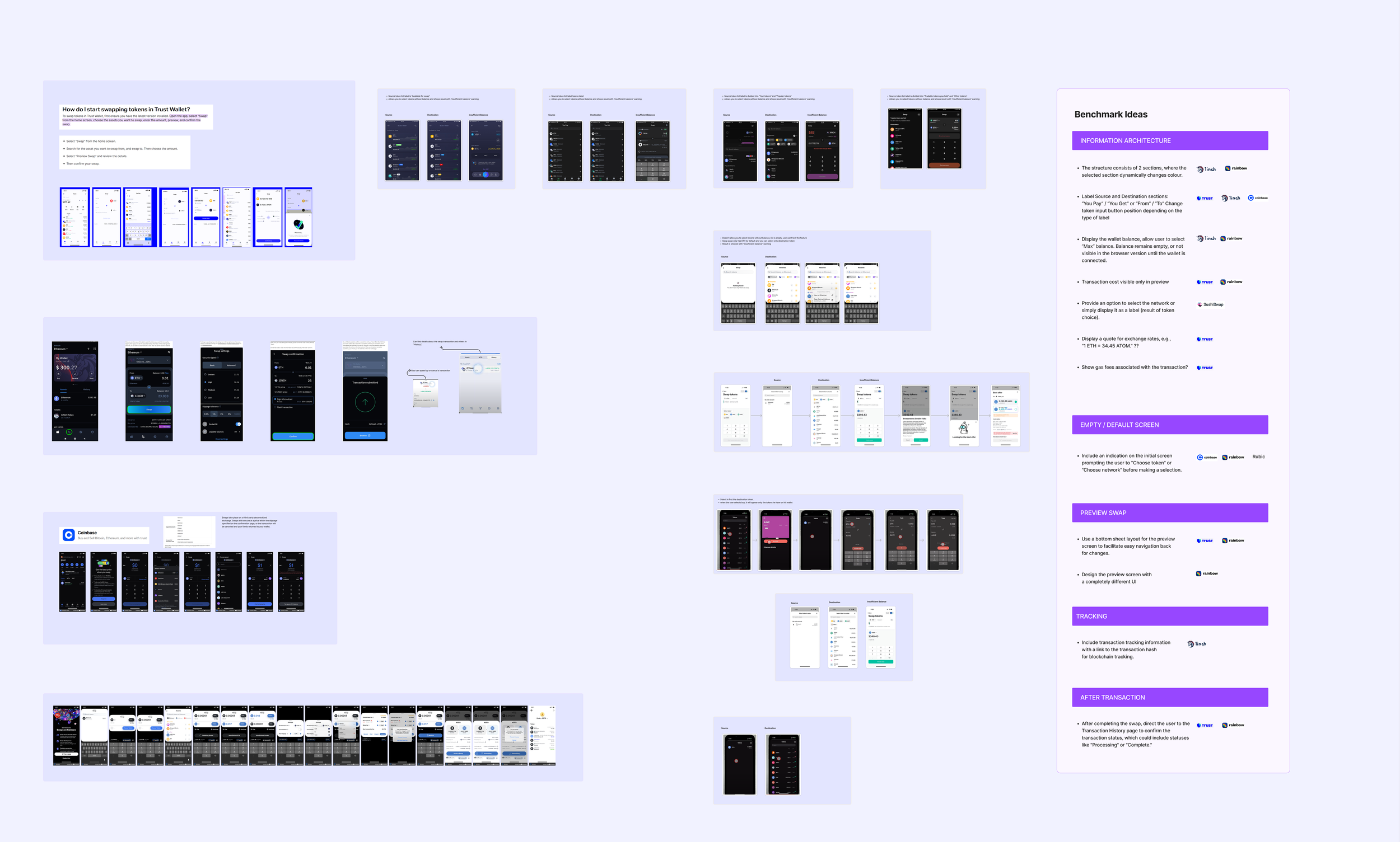
Part of the benchmark and ideas that guided next steps
04. Defining the User Journey
Based on the product’s technical brief, we created frontstage/backstage journey maps showing every step between the user interface and background blockchain processes.
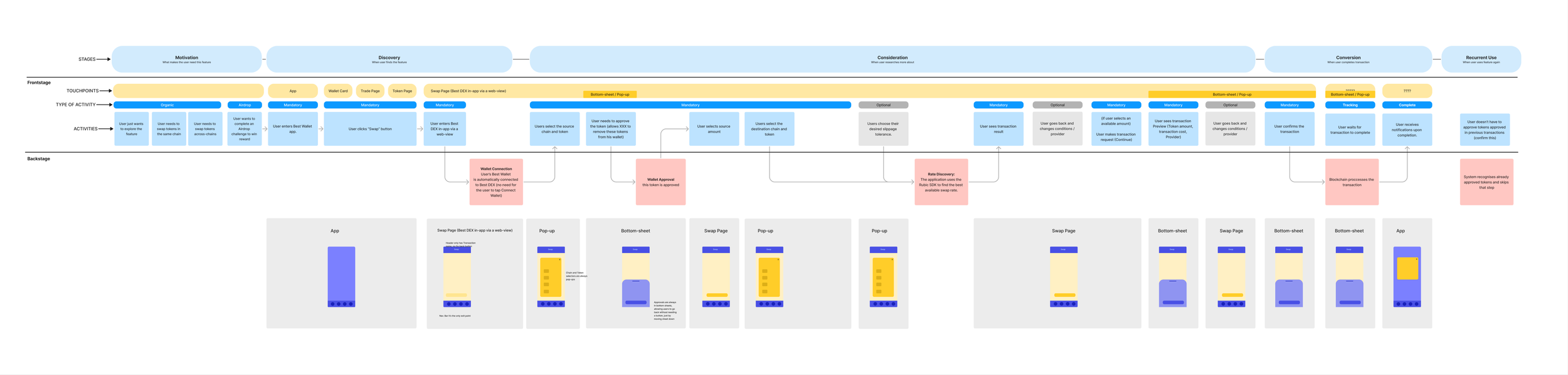
Technical journey map, highlighting front and backstage steps
This helped us:
Identify dependencies, blockers,
and potential wait timesDefine when and how to surface progress and error feedback
Simplify the visible flow while maintaining backend awareness

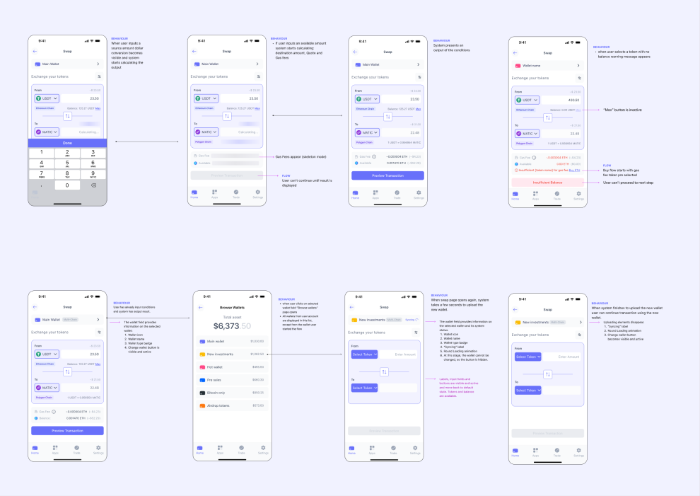
05. UX Design & Feature Definition
We collaborated closely with product and business stakeholders to prioritise features.
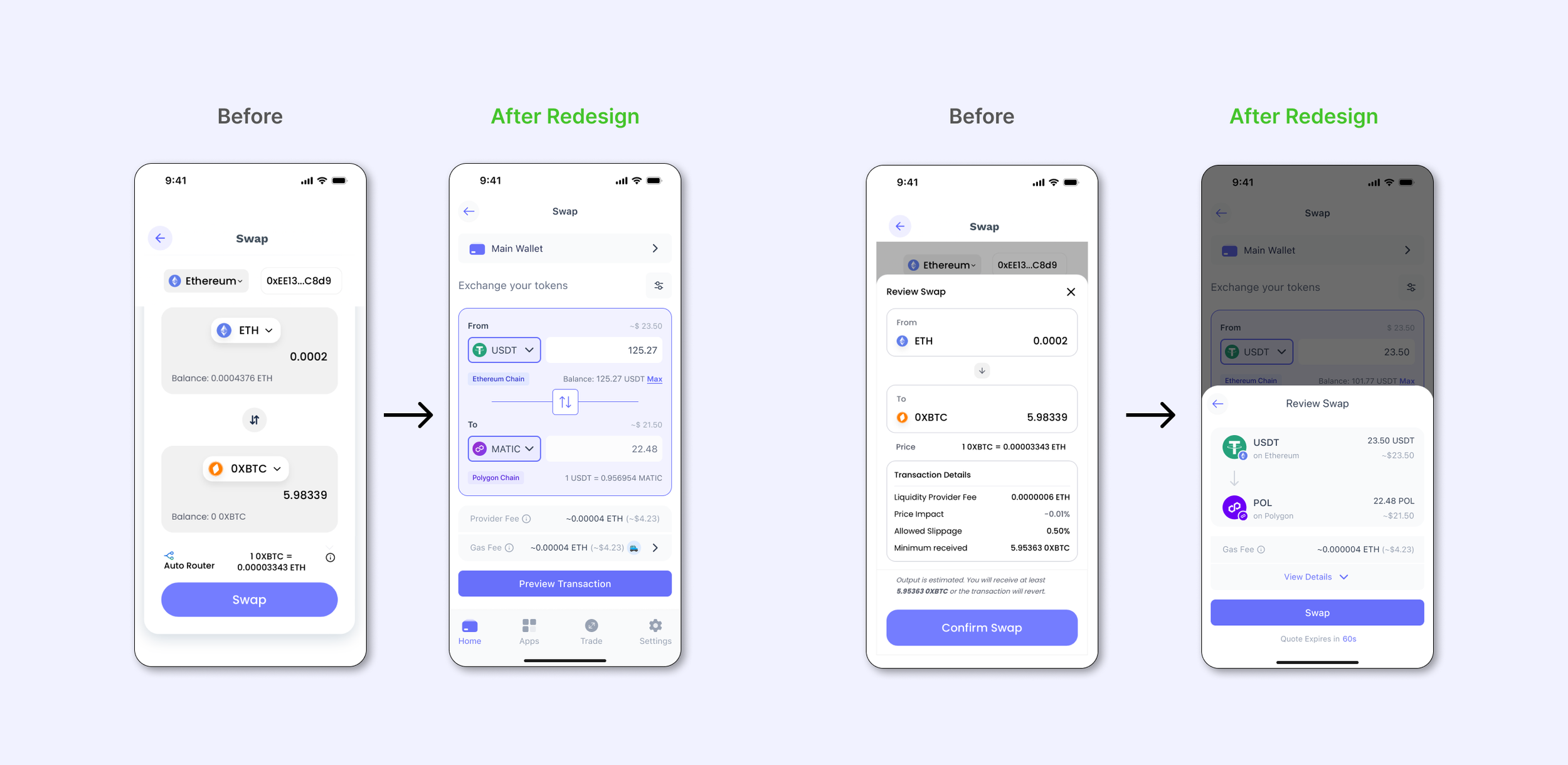
After mapping third party flows, we simplified the architecture, made task flows, reduced screens, and rewrote copy for accessibility.
The goal: make complex blockchain actions feel simple, predictable, and safe.
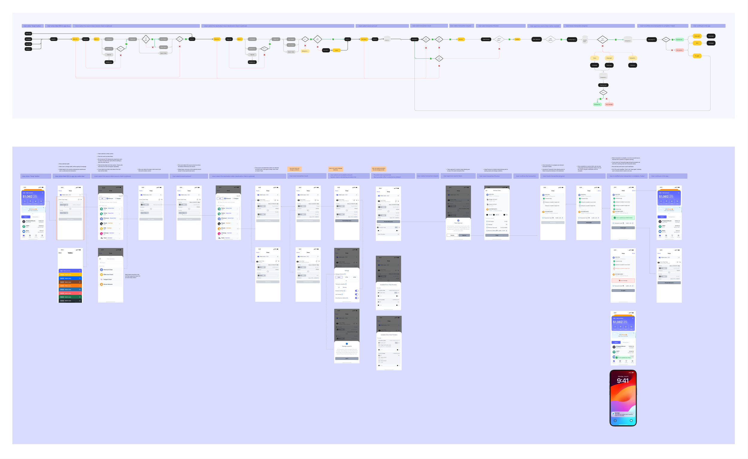
Initial flows based on third party solutions
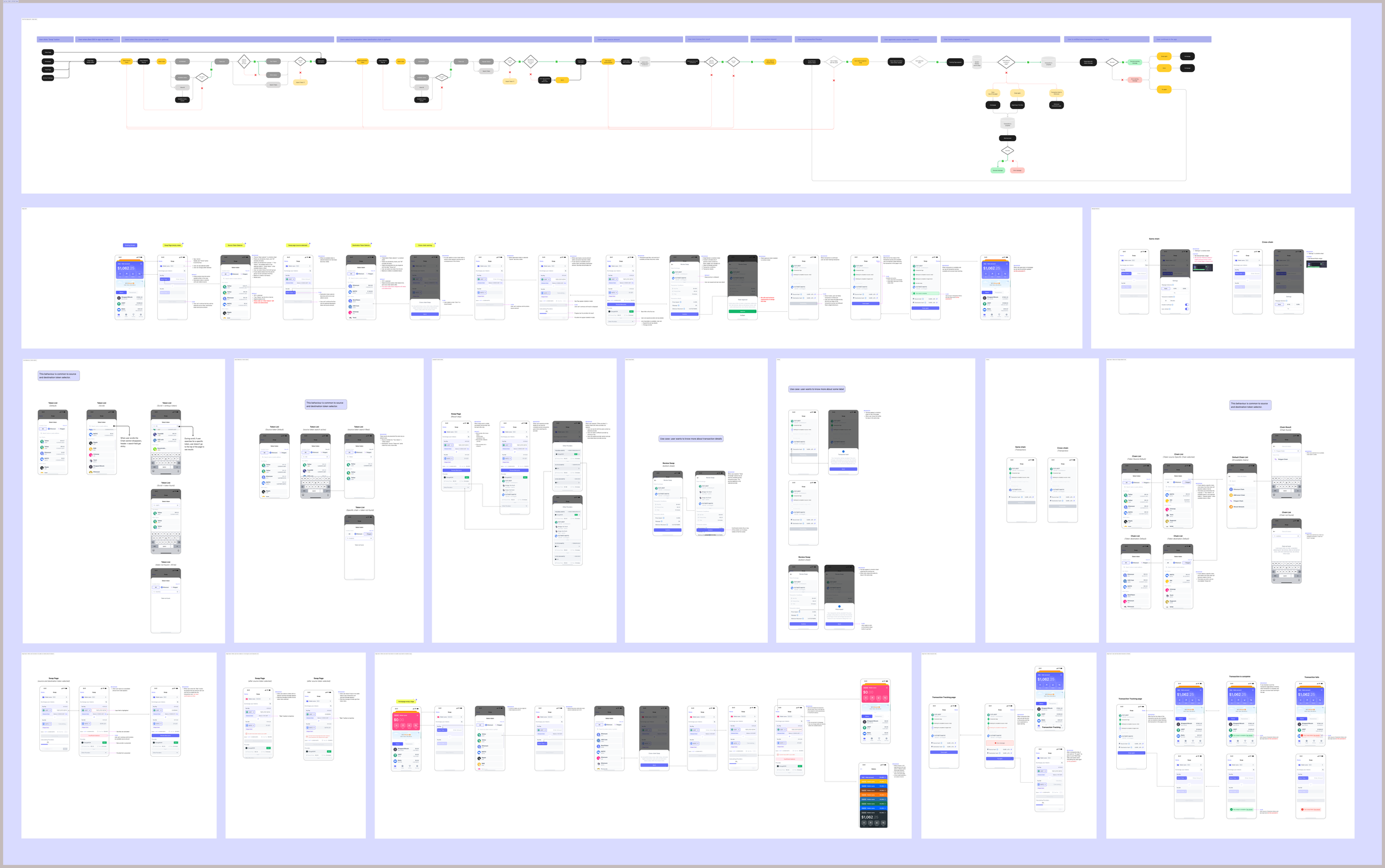
Wireframe iterations covering some key stages of the experience.
06. Testing & Validation
We performed several User interviews to validate design assumptions:
Users appreciated simplicity and automation
Users wanted visible progress tracking (“reassurance moments”)
Tooltips and settings were under-discovered
Some steps (review & progress) still felt overwhelming
AI transcription and summarization helped uncover friction points and guided UX tweaks, making flows clearer, faster, and easier to use.
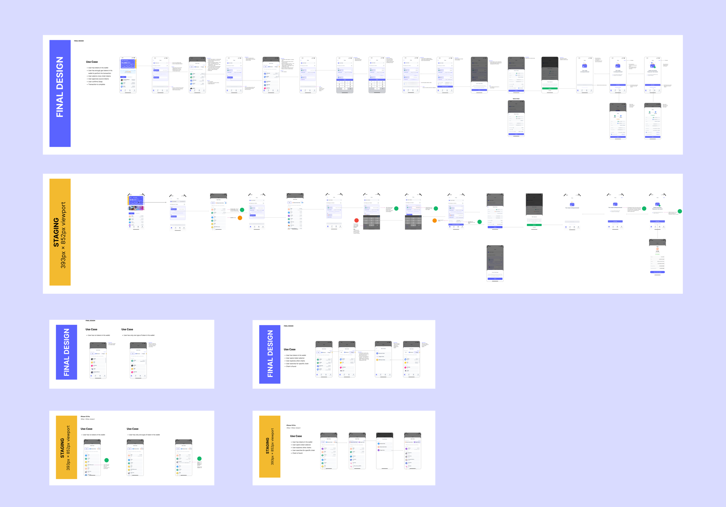
07. Delivery & Handoff
Once approved, the designs went through an engineer review to validate feasibility and interaction logic before handoff. We then finalised components and delivered production-ready files with complete implementation documentation, including:
A handoff file detailing happy paths, edge cases, and failure states.
Screen-level interaction notes outlining default states and available actions.
Examples of handoff documentation
08. Design QA
Before release, we ran a full Design QA (Quality Assessment) to ensure implementation accuracy. Each issue was categorised by impact:
High
Blocks user flow
Medium
UX deviation, recoverable
Low
Visual inconsistency
This systematic QA reinforced the product’s design quality and ensured parity between the final build and the intended user experience.
Example of design QA feedback, comparing the final design files with the staging implementation.

09. Post-Launch Behavioural Insights
After launch, we looked at customer feedback, behavioural analytics, and session replays to see how people really used the feature. AI tools helped us spot patterns and correlations. These insights revealed key friction points and guided targeted UX refinements — improving clarity, performance, and overall flow efficiency.
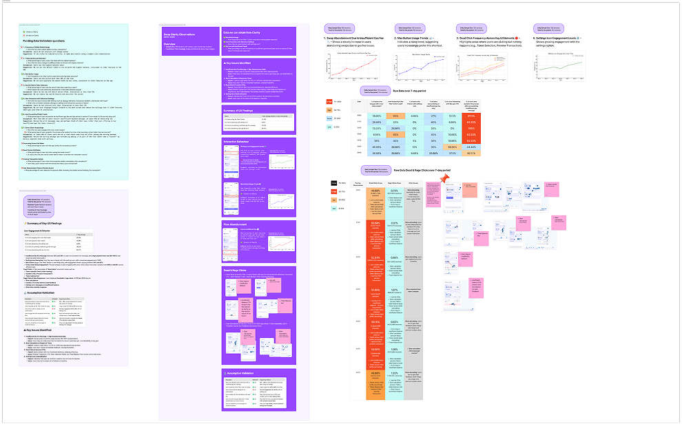
Session replay analysis, observation notes and a presentation of insights to the team.
10. AI-Assisted Design Process
AI tools played a supporting role across multiple stages of this project — accelerating insight gathering and decision-making:
Research: Automated clustering and pattern recognition helped identify shared UX models across leading crypto wallets.
User Interviews: AI transcription and summarization simplified qualitative analysis, allowing the team to map themes and sentiment faster.
Behavioural Analysis: Post-launch, AI-driven analytics surfaced hidden correlations between friction points and task completion, guiding targeted improvements.
By integrating AI into the workflow, the design team was able to focus on strategic thinking and creative problem-solving, rather than manual data synthesis.
11. Conclusions
This project demonstrated how design bridges user needs, technical feasibility, and business goals. By combining real user feedback with close cross-team collaboration, we created a solution that simplified complex blockchain interactions and aligned stakeholders around a shared, user-centered vision. It also established a repeatable framework for validation and post-launch analysis — reinforcing how strategic design drives innovation, usability, and long-term value.
Simple design is not about fewer features, it’s about fewer doubts.
Next steps
The next step involved user interviews to uncover the “why” behind user behavior — insights that would inform a more intuitive, data-driven redesign of the swap experience.