Streamlining Token Purchases
with an Integrated Buy Widget
Designed an in-app widget enabling users to buy presale tokens directly from their crypto wallet. AI-assisted tools helped us uncover usage patterns and accelerate research, allowing the team to focus on a smooth, trustworthy, and conversion-optimised presale experience from discovery to purchase and claim.
My Role: Design Lead / UX Designer
Duration: 10 months Team: 5 designers
Other Teams: Product, DEVs, Business, Data, CRM

01. Impact
Introduced a unified token purchase flow fully integrated
within the wallet experience.Improved user conversion and reduced friction across presale transactions.
Established a data-driven framework for continuous optimisation
and post-launch iteration.
02. Overview
Challenge
Purchasing presale tokens required users to leave the wallet and complete transactions via browser widgets, creating friction, lowering trust, and breaking engagement. The goal was to design a seamless in-app experience that feels reliable, intuitive, and scalable for future tokens and chains.
Objectives
Create an end-to-end in-wallet token purchase experience.
Reduce friction from discovery to claim.
Reuse familiar patterns to ensure UX consistency.
Build a scalable foundation for multi-token and multi-chain expansion.

03. Research & Competitive Analyses
Benchmark
We evaluated leading browser-based buy widgets to understand functionality, accessibility, and friction points. AI-assisted clustering and summarization helped us:
Quickly identify recurring UX patterns.
Highlight where users struggled with connectivity or confirmations.
Spot opportunities for a connected experience, instead of an isolated purchase.
The findings revealed a key opportunity: most widgets treated purchase as an isolated action, while users needed a connected, end-to-end experience within their wallet.
04. Lifecycle Mapping
We mapped the entire presale lifecycle — from token discovery to token claim — to identify how this new feature could support users at every stage. This holistic approach helped define the value proposition:
This feature shouldn’t just enable purchase — it should guide, inform, and retain users.
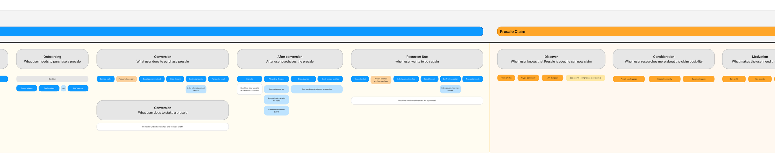
Excerpt from the Presale Lifecycle — before, during, and after purchase
Key insights:
Many users arrive during high-urgency purchase windows.
Post-purchase steps (like claiming tokens) often lacked visibility.
There was potential to encourage engagement with new token listings.
05. Task Flow & Alignment
We created detailed task flows to align stakeholders on the shortest happy path, edge cases, validation steps, and feedback messages. We also considered emotional context, supporting users in high-pressure moments.
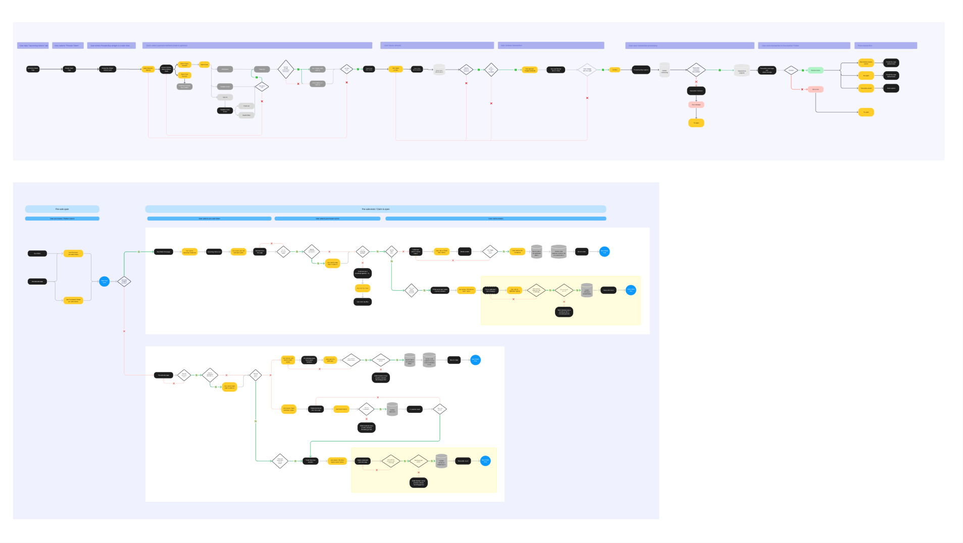
Task flow for happy path and other use cases
06. Wireframing & Iteration
We began with low-fidelity wireframes to outline layout logic and key interactions.
These were validated internally with cross-functional teams to ensure technical feasibility and content alignment.
Through multiple iterations, we refined the flow to balance:
Simplicity for first-time users
Familiarity with existing feature behaviours.
Efficiency in the fewest possible steps
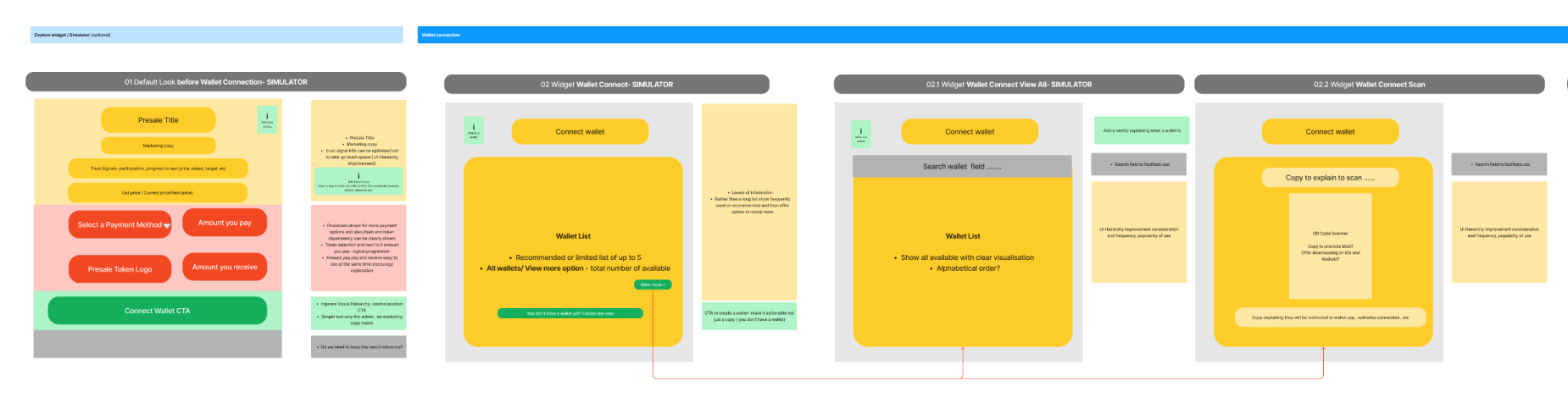
Initial wireframes to align on UX intention
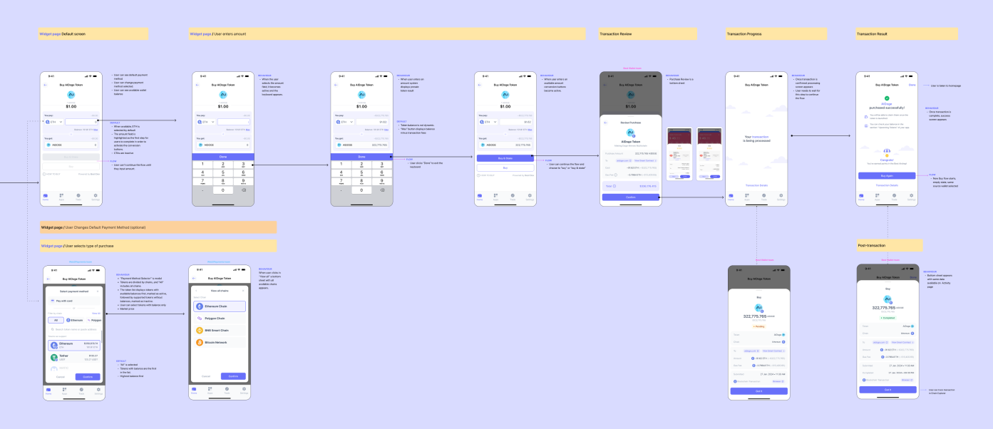
Flow mockup iterations
07. Edge Cases Design
Edge cases — such as insufficient balances, failed transactions, or unsupported tokens — were designed to provide guidance, not dead ends.
We focused on:
Clear recovery options and feedback messages
Reusing design patterns from other wallet flows
Maintaining trust and retention during error handling and retries

08. Delivery & Handoff
Once approved, the designs went through an engineer review to validate feasibility and interaction logic before handoff. We then finalised components and delivered production-ready files with complete implementation documentation, including:
Complete handoff file with all states and flows
Screen-level annotations for default and interaction
Detailed specs for integrations with backend
09. Design QA
Before release, we ran a full Design QA (Quality Assessment) to ensure implementation accuracy. Each issue was categorised by impact:
High
Blocks user flow
Medium
UX deviation, recoverable
Low
Visual inconsistency
This systematic QA reinforced the product’s design quality and ensured parity between the final build and the intended user experience.
10. Post-Launch Behavioural Insights
After launch, we collected feedback, analytics, and session replays across hundreds of sessions. AI tools helped reveal hidden patterns — where users struggled or dropped off — and guided targeted UX refinements.
We reported these insights weekly to product and business teams, highlighting behavioral trends and friction points that weren’t visible in standard quantitative data. These insights informed design tweaks, improving conversion, clarity, and overall flow efficiency.

Session replay analysis, observation notes and a presentation of insights to the team.
11. Continuous Improvement
Several iterations followed post-launch, focused on:
Reducing friction during conversion and error recovery
Supporting new chains and token integrations
Improving clarity in status and confirmation feedback
These improvements led to a measurable increase in user conversion and transaction completion, reinforcing the value of continuous data-led iteration.
12. Conclusions
This project demonstrates how strategic UX can combine technical complexity, business goals, and user trust in a single, coherent experience. By embedding user insights and AI-assisted analysis at every stage, design became a continuous driver of adoption, conversion, and long-term engagement.
Design doesn’t end at launch — it evolves with every user interaction.